When providing your presentation, your message needs to be understood with EACH slide, in 3 seconds or less, else your listeners will stop paying attention.
Some presentations that I have seen are slides heavy with text because the person conducting the presentation is afraid that they will forget what they are wanting to say.
Thus, when reading your slides word for work, you simply put your listeners to sleep out of boredom.
Your audience can read your slide faster than you can read the wording, so there really isn’t a reason for your being there if that is all you are doing. People already know how to read.
These are slides you will be creating, not documents.
For slides, you can use pictures. They really can be worth a thousand words, and pictures will always beat text.
“Why?”, you ask.
Searches related to 90% of information transmitted to the brain is visual, and visuals are processed in the brain at 60,000 times the speed of text. ~ Google
And, for those doubting-Thomas’ reading this, I did do a search for a study for visuals over text for learning and DID find one to share with you here. As humans we remember images far better than we do text.
You’re right, just because something is in print, especially on Google, does NOT make it true… which is why I presented you with the case study linked above.
However, if you would prefer to do a deeper study into this topic, I present you with Dr. John Medina’s Brain Rules.
WE REMEMBER
10% of what we read
20% of what we hear
30% of what we see
50% of what we see AND hear
70% of what we discuss with others
80% of what we personally experience
95% of what we teach others.
~ Edgar Dale
For an example of this, if you were to compare the size of Australia to the United States and you write down the square miles (or square kilometres for those of you who prefer metric), which do you think would be quicker to understand and remember… a visual like the one below… or text detailing the sizes of each of these countries?

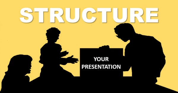
Creating a Consistent Theme
Be sure to select a theme for your presentation that will set the mood and tone that you want your audience to experience, and be sure to stick with your theme consistently throughout your presentation.
Inconsistency makes a presentation far too difficult to understand.
Examples of constancy are:
- Background colour – use ONE colour for all of your slides.
- Font – use no more than TWO different fonts.
- Images – find images that feel similar in overall appearance.
All the elements on your slides need to create a unified look in your chosen theme.
If something does not fit your theme, exclude it, even if you deem it the greatest image ever found. If it does not fit your theme do NOT use it.
When reviewing other’s presentations in NoteandPoint and SlideShare NOTE how the most attractive presentations use the same background colour for their entire presentation, as well as their use of fonts and images… they are unified, correct?

What is the Perfect Number?
Why THREE is, of course.
Did you know that three is the smallest number we humans need in order to create a pattern?
It is the prefect combination of briefness and beat or tempo. The following Latin phrase says it all: “omne trium perfectum” or “everything of three is perfect”.
For examples of three in our every day lives:
- Three Blind Mice
- Three Little Kittens Who Lost Their Mittens
- Three Musketeers
Bet you can name at least two more examples like those above.
It is obvious that when in groups of threes, things are more fun, interesting and easier to remember than other numbers.
So, knowing this, here is how you can use the rule of three on your slides.
- Use no more than 3 bullet points or items per slide. Text can be larger and easier to read too.
- Use only three colours that match in tone, per slide to keep a proper visual balance.
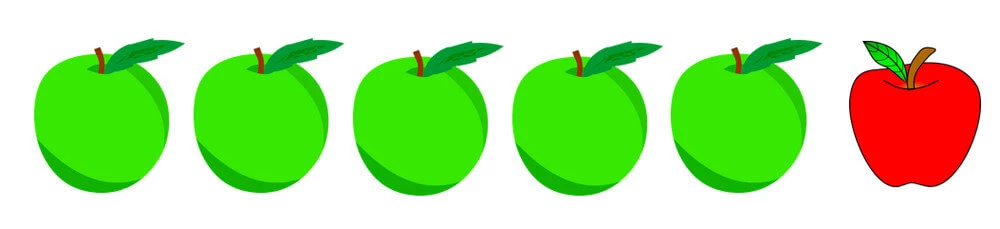
- Use pictures in sets of three, provides visual balance and interest.
American entrepreneur Tim Ferriss and well-known public speaker has a rule of three. Try Google searching Tim sometime and you will see links in your search results like the following:
- 3 Rules of Marketing and Branding
- 3 Golden Rules to Adopting Healthy Habits
- 3 things you should do every day to be successful
The following advice can be found on Tim Ferriss’ blog:
- Keep your introduction in your presentation to about 2 minutes, which should state what your presentation is all about and why your listeners should care.
- Have no more than 3 main segments in your presentation. Each one should be no more than 10 minutes each.
Make sure that your main message along with any sub-messages are all backed up with relevant facts. - The close of your presentation should take about 2 minutes, and should include your Call to Action.
Be sure to specify exactly what you want your listeners to do or what decision you want them to make.
Tim states that in his introductions, he prefers to start with his story and then he will introduce his 3 concepts that help his listeners understand whatever his topic is about.
Then, in his 10-minute segments, he uses what he calls PEP or point-example-point or his preference of EPE, which is example-point-example format.
PEP meaning that you would illustrate your idea and then provide an example or better still… a case study, then repeat your idea.
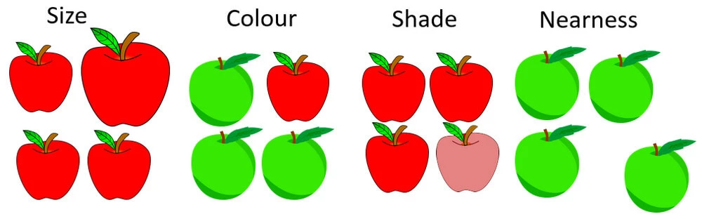
Understanding the Power of Contrast
A great way to convey your message on slides, you can use contrast.
Contrast is created when you can see a visual difference between two or more objects on a slide.
Used properly, you can gain the focus of your audience when using contrast to get your message across to them quickly.
Example shown in the image below.
There are other ways of attaining contrast in your presentation including size, shape, shade and nearness.
Be sure to use contrast that shows a significant difference rather than a subtle difference, as subtle differences would or could cause your audience confusion.
You want to leave NO room for confusion.
For visual examples, see images below.
Directing Your Audience’s Attention
Most viewers will see the words “Live Your Dreams” in the image below. This is because those words are larger and bolder than the remaining words.

Your viewers need to be directed to the area you want the to see, immediately upon seeing the slide.
If you do not accomplish this you will lose your audience because they can become confused or even overwhelmed.
Once again, there are different ways to direct the attention to your message. Some of these methods are: size, colour, angle, and animation.
Place Objects on Slides with Intention
When starting to design you slides, you need to remember that each slide is your canvas and it is where you will be telling your story.
Therefore, you need to always place objects on EACH of your slides with meaning, in order to make sure your message is clear, concise and constant throughout your presentation.
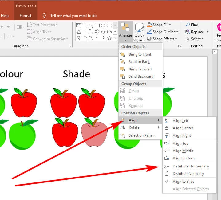
Most viewers consider objects that are close to each other as being related, so make sure EVERYTHING is aligned properly.
Apparently, the golden rule with aliment is that you do not want to have any of your objects on your slide look though they were placed randomly.
Randomly placed objects tend to make a presentation look though it was NOT created by a professional. So, be sure to use the align and distribute tools in PowerPoint.
The Secret About Whitespace
Whitespace is simply the blank space between text and images.
Some people think they need to fill up a slide with as much text and graphics as they possibly can. A well-designed presentation does the exact opposite.
The less clutter you have on your slides, the more powerful your message will be to your audience.
Using whitespace strategically will have your audience paying attention to what it is that you are saying to them.
There is a gridlines tool in PowerPoint that you can use to help you maintain a strong slide layout. See image below to note where to find your Gridlines tool.

You can even use gridlines to identify the center of your slide and position your objects just right, simply by slowly dragging objects near to each other, as shown in the image below.

Always remove repeated excessive clutter from your slides, such as logos, banners, page numbers and even legal disclaimers.
You only need your logos, banners and disclaimers on either your first slide or your last slide.
The space on EACH of your slides is “prime real estate” so use it wisely, if you want your viewers to remember your message.
To constantly repeat a logo would be construed as pushing your presentation though a commercial, and no one likes to be “sold” something.
Do Not Use PowerPoint’s Templates
When telling your unique story to your viewers, your presentation needs to be every bit as unique and consistent as your story.
The templates included with PowerPoint are very plain, and you do not want to bore your audience.
Using a PowerPoint template screams out that you did not put any effort into creating your presentation for your viewers.
Thinking that will only have your audience literally zoning out during your presentation.
Always create your own templates from scratch.
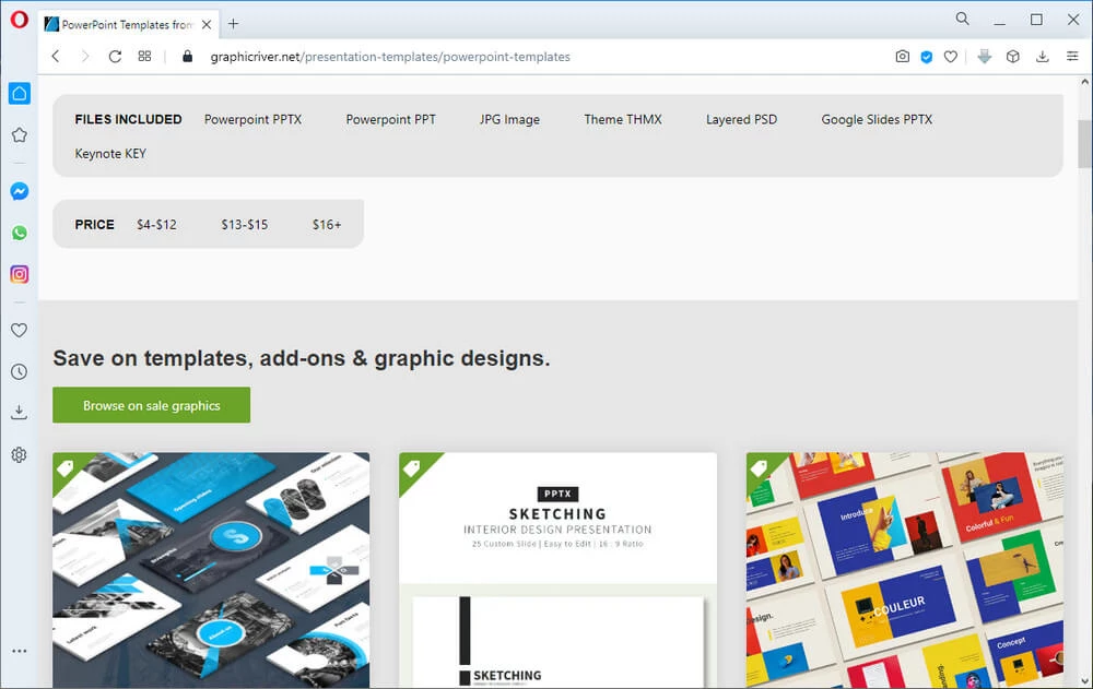
If your creativity is a little rusty and you are pushed for time, you could always purchase a slide template from an online source such as GraphicRiver.net, which also provides the logo templates and more.
OR… you could consult CreativeMarket for their slide templates for both PowerPoint and Keynotes.

Be Sure of Your Screen Ratio
Before you begin your layout, you will need to know for certain where your presentation will take place; Either in a boardroom or a tradeshow booth, for example.
Will the projector screen be square or will you be using a widescreen monitor?
If a widescreen monitor will be used, then your best ratio would be 16:9, as this way your PowerPoint presentation will fill the entire screen.
However, the ratio used for the older TV monitors which is still in use in some conference rooms, is traditionally 4:3 ratio.
As of PowerPoint 2013, this software uses the 16:9 ratio by default.
Knowing if you will be converting your PowerPoint presentation into a video in the future, the 16:9 ratio is now the preferred setting, as there will be no unwanted borders created around your video.
Slides Need to Change Seamlessly
In PowerPoint this is known as transitioning.
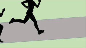
Placing images partially off your slide is known as bleeding, because the image is “bleeding” off the edge of the slide.
By setting your images to bleed off of your slide, this could create a stronger emotional appeal for that image.
Bleeding images can also create a great way to change or transition one slide to the next, as shown in the images of the 2 slides below.
Next month, I will present Part 3, Adding Killer Content to Your Slide Presentation.
Once again, should you have any question regarding how to structure your killer slide presentation, I hope you will leave me a comment below, and I will respond in a timely manner.
SOURCE
Slides Made Easy 2nd Edition (my affiliate link) by Adam Noar
Credit for Header: image by Needpix.com
Credit for Runners, Athletes, and fruit graphics all images by Pixabay.com